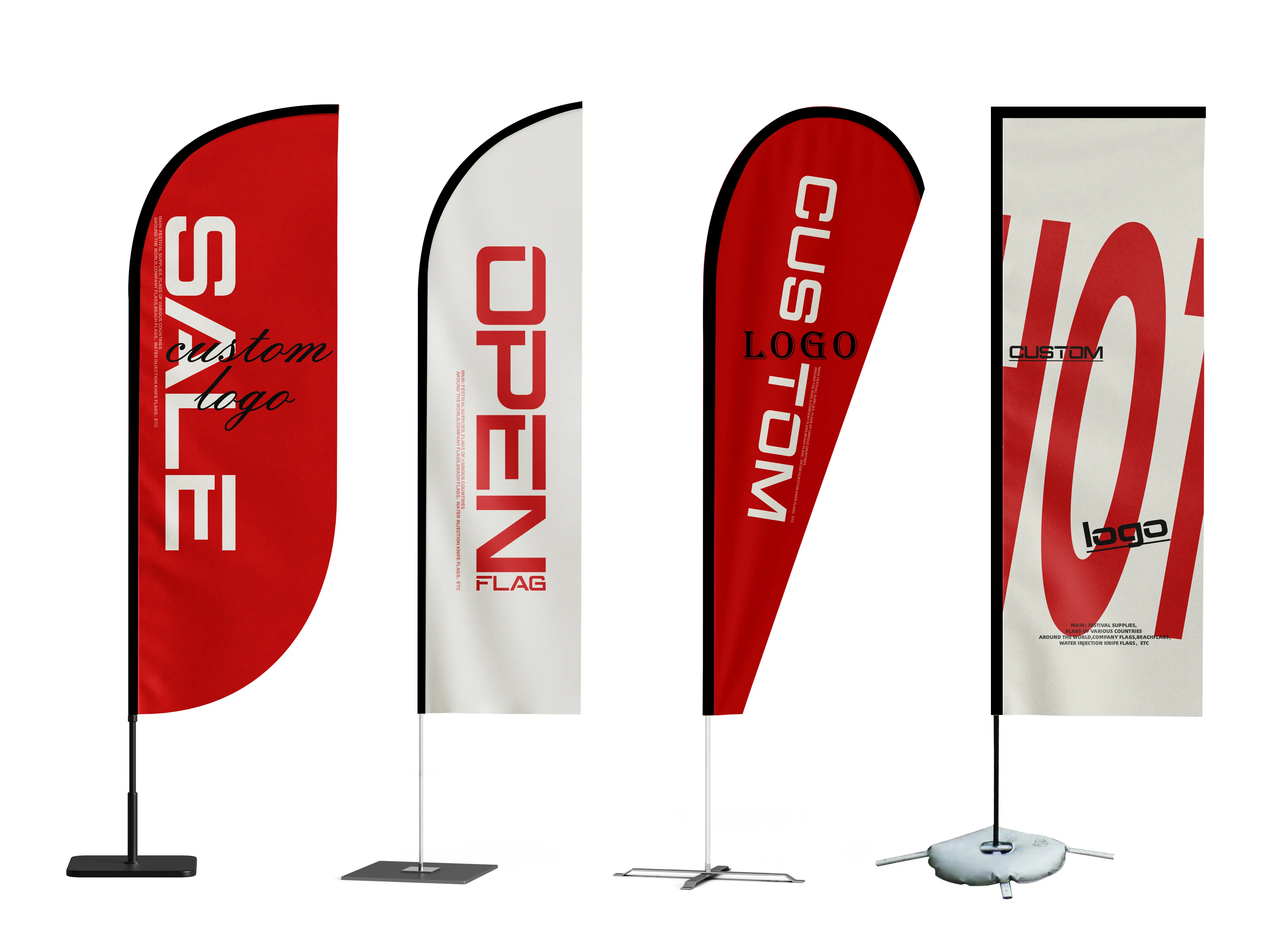
How to Design Tear Drop Flags for Visibility?
Choose Contrasting Colors for Easy Visibility
When designing tear drop flags, the first element that will be seen is the color. Color contrasting is a popular way of boosting visibility, so choose appropriate colors. Use bold, saturated colors that stand out against the background. Teardrop flags colors are typically red, blue, and yellow. Make sure to pair so that the text and colors contrast for maximum engagement and visibility. Some muted colors will blend in to the background. If the color red is chosen, also understand that in some cultures red is negative and other colors are preferred. Ensure the colors chosen are appropriate for the culture of the audience and that the colors also collide for maximum visibility of the flag.
Optimizing Graphics and Logos on Teardrop Flags
Considering the teardrop shape of the flag, careful placement of logos and core message-graphics should be placed at the most stable and most visible part of the flag’s shape; the “sweet spot.” This spot is the upper-center of the flag and balances well with the rest of the flag. Designs should be bold and simple. Elaborate details tend to disappear or look messy when the flag is seen from afar or when waving in the air. Logos also need to be appropriately sized so that they do not become unrecognizable or dominate the entire design. Vector graphics should be used as they allow for unlimited scaling without losing design quality. It is also helpful to limit the number of graphics to only 1 or 2 to help focus on the core message and to avoid adding distraction to the overall flag design.

Select Appropriate Typeface for Effective Communication
Since banners must contain text that will presumably be read in an instant, text type must be carefully chosen. Recommended typefaces include sans serif typefaces like Arial, Helvetica, or Calibri that contain simple lines and can be read from a distance. Also, steer clear of decorative or handwritten typefaces, as they can be more challenging to read both from a distance and when the banner is in motion. Text should be set at a sufficient size that is easily read. As a good rule of thumb, text should be set such that it is easily read from 50 feet away. In addition, avoid uppercase text as it can become overwhelming when read. Instead uppercase certain letters to create a distinction amongst headings, subheadings, and body text. Long form text should also be avoided as tear flags incorporate short form text. Aim to include a concentrated phrase or tagline that effectively communicates your text in a maximum of 5 to 7 words.
Choose Quality Tear Drop Flag Materials for Durability and Visibility
Most tear-drop flag designs are made with polyester for outdoor use. Polyester Tear-Drop Flag is lightweight which makes it possible for the flag to wave gently which helps it draw attention. It is also sturdy enough to withstand windy, rainy, and sunny conditions while keeping the flag visible for months. If you need your message to be more visible, consider double-sided flag printing which is perfect for events, trade shows, and heavy traffic streets. Make sure to stay away from flimsy, low-quality, and cheap fabrics as they are more likely to wrinkle and easily tear to help protect the flag's appearance and readable content.
Consider the Size and Height of the Installation
The visibility of your teardrop flag depends on the size of the distance you need it to be visible from and the installation height. Depending on the purpose, smaller flags (3x5 feet) are ideal for storefronts or trade show booths. Outdoor events, construction sites, and open areas where visibility from a distance is needed work better with larger size flags. The flag should be placed on a pole that can be tall enough to avoid visual barriers like people, vehicles, other flags, and signs. The flag must be visible from a distance and be more visible from other locations, so make sure the pole is tall and strong. Built to last, the pole needs to be firmly installed in the ground. A loose flag that can swing around in the breeze will look lower quality and unprofessional.
Design Matching With Purpose and Audience
Customizing flags and their designs for their purpose will increase the desired look and feel as well as will provide better effectiveness for its purpose and audience. At sporting ‘corporate’ events use corporate colors and professional designs wiith graphics to complement the corporate. For promotion and advertising use professional graphics with design finishes. The design should also consider if the primary audience is international. It is important to ensure international design practices are adhered to as the design could touch on cultural symbols that can be seen as offensive or misinterpreted. The environment in which the flag will be displayed should also be considered. For flags in busy city areas, stronger and bolder colors should be used for better visibility overall. For trade shows or expos it's important to include your brand's top 2 or 3 key selling points so that participants are quickly drawn to the booth. The more you consider and tailor the design to the where and who, the more contextual and relevant it will be.